Chart Overview
Properties of chart elements might be different depending on different layouts.
| Chart Type | Data Type | Data Source | Max. Number of Data Source | Linkage |
|---|---|---|---|---|
| Dashboard | Number, real-time data | Object property | 1 | - |
| Speedometer | 1 | - | ||
| Line Chart | Two-dimensional array (one of them must be number), history data or relational data | Numeric object property, service and form template | 20 | Links with input boxes, drop-down boxes, date controls, radios and checkboxes. |
| Spline Chart | 8 | |||
| Bar Chart | 8 | |||
| Area Chart | 8 | |||
| Scatter Chart | 8 | |||
| Histogram | 1 | |||
| Spc Diagram | 1 | |||
| Funnel Chart | 1 | |||
| Spider Chart | 8 | |||
| Pie Chart | 2 | |||
| Donut Chart | 2 | |||
| Bubble Chart | Three-dimensional array (two of them must be number), history data or relational data | Object property, service and form template | 8 |
Free Layout
This section introduces general properties of charts, and for special properties of each chart, refer to specific chapters.
- ID: Automatically generated. You can use it for writing scripts.
- Data source
| Parameter | Description |
|---|---|
| Object Selector | Select properties or services of object instances to be the data source of the chart. info
|
| Object Name | The name of the bound data source. |
| Display Name | The name displayed on data notification prompts in operation center. Object and data source aliases are displayed by default without specific configuration. |
| Type | Switch display types of the chart between spline chart, line chart, bar chart and area chart. |
| Data Color | Change the display color of data sources. |
| X Axis | Data parameters displayed on X/Y axis. You can hide both axises parameters. info If the data source is an object service, make sure to set the return value type to JSON. Otherwise, X/Y axis cannot be customized. |
| Add Column | Add a field to Y axis without changing X axis. You can add multiple fields. |
| Parameter Configuration | Bind the input parameter of the data source with other elements for data linkage. For details, see Data Linkage. |
- Title
| Parameter | Description |
|---|---|
| Component ID | Automatically generated. You can use it for writing scripts. |
| Display | Set whether to display chart title. |
| Main Title | Set the chart main title. |
| Text Style | Set the main title styles, such as font, font size, color, and more. |
| Alignment | Set the main title alignment. |
| Sub Title | Set the sub title similar to configurations of the main title. |
- Style: Set styles of charts based on specific requirements.
- Basic settings
| Parameter | Description |
|---|---|
| Switch Type | The drop-down list at the upper-right corner of the chart. You can switch chart types to view the same data source. info The data source might not be displayed correctly if the chart does not match the data source. |
| Border | Set the border style of the chart, including border width, corner and color. |
| Padding | Set the distance between data and border. |
| Background Color | Set the background color of the chart by setting RGBA values.. |
| Chart Color | Set the background color of the chart area. |
| Display Level | Set the relative display priority of the element. The higher the level, the more front the chart is displayed. |
- Legend
| Parameter | Description |
|---|---|
| Display | Set whether to display chart legend. |
| Border | Set the border style of the legend, including width, corner and color. |
| Alignment | Set the legend alignment corresponding to the chart. |
| Layout | Set the legend layout corresponding to the chart. |
| Text Style | Set the legend text style. such as font, size, color and more. |
| Background Color | Set the background color of the legend. |
- X axis
| Parameter | Description |
|---|---|
| Type | Select the data of X axis from Default and Timeline. |
| Format | Format the X axis data when setting Timeline as Type. |
| Display X Axis | Set whether to display X axis scales. |
| Crosshair | Set whether to display crosshairs when mouse moves. |
| Scale | Set the origin value and interval of the X axis scales when X coordinates are numbers. |
| Title | Enter the X axis title. |
| Text Style | Set the title text style. |
| Title Position | Set the title position. |
| Axis Color | Set the line and scale color of X axis. |
| Axis Font Color | Set the scale value color of X axis. |
| Rotation Angle | Set the angle of scale values. When the value is long and cannot be fully displayed, you can set an angle to tilt it. |
| Vertical Text | Set whether to display scale values vertically. |
- Y axis
| Parameter | Description |
|---|---|
| Type | Select the Y axis type from Single Axis and Multi-Axis. For Multi-Axis, each data source is independent. |
| Display Y Axis | Set whether to display Y axis scales. |
| Unit | Set the unit of Y axis scales. |
| Grid | Set whether to display Y axis grid lines. |
| Crosshair | Set whether to display crosshairs when mouse moves. |
| Scale | Set the origin value and interval of the Y axis scales. |
| Title | Enter the Y axis title. |
| Text Style | Set the title text style. |
| Title Position | Set the title position. |
| Axis Font Color | Set the scale value color of Y axis. |
| Rotation Angle | Set the angle of scale values. When the value is long and cannot be fully displayed, you can set an angle to tilt it. |
| Max | Set the maximum value of Y axis. The maximum value of the data source is displayed without specific configuration. |
- Label
| Parameter | Description |
|---|---|
| Display | Set whether to display chart label. |
| Border | Set the border style of the label, including width, corner and color. |
| Label Color | Set the label color. |
| Background Color | Set the background color of the label. |
| Alignment | Set the label alignment corresponding to the chart. |
| Data | The display content of the label. When it is numbers, you can set decimal places. |
| Font Size | Set the font size of the label. |
| Spacing | Se the line spacing of the label. |
- Notes
- Display: Set whether to display notes at the lower-right corner of the chart area.
- Content: Enter the note content.
- Interact: Set interaction events, including Click, Load Complete, Click Data Point and Double-click Data Point.
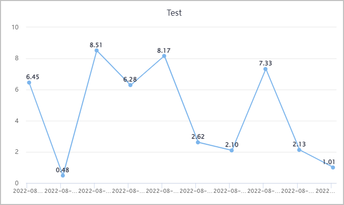
Line Chart
Line charts are often used to display continuous data changes along time. Applicable for viewing data changing trends.
Spline chart is similar to line chart.
- Drill-down column: When the data source is relational data, you can add a drill-down column field, and then by clicking a data point on the chart, more detailed data is displayed.
- Backend name: Enable it and then you can use values returned from the backend as data name.
- Style: Change line width and type, node icon, size and color.
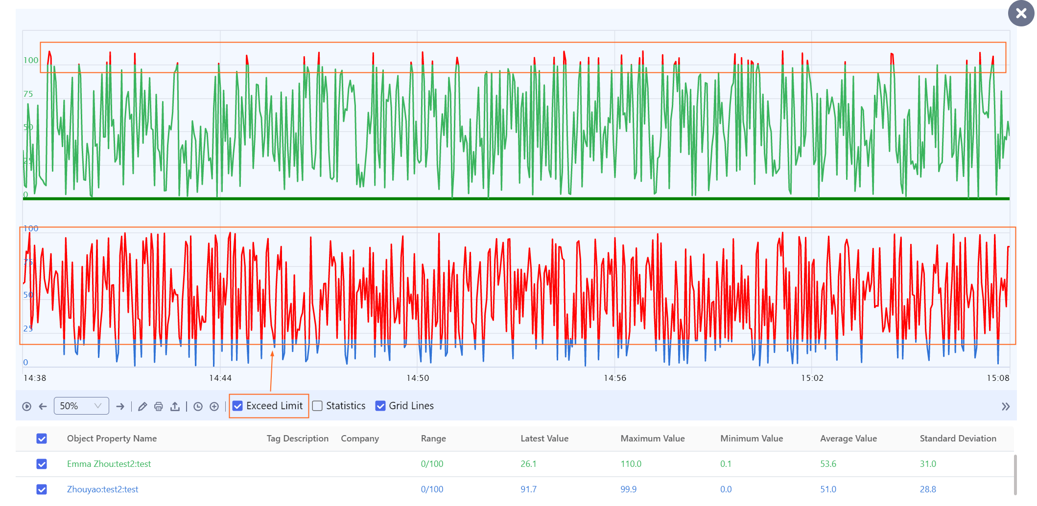
- Alarm: Set the maximum and minimum values to form an alarm range, and two red lines are displayed on the chart for easy recognition of data out of range.
- Grid: Enable it to display grids.
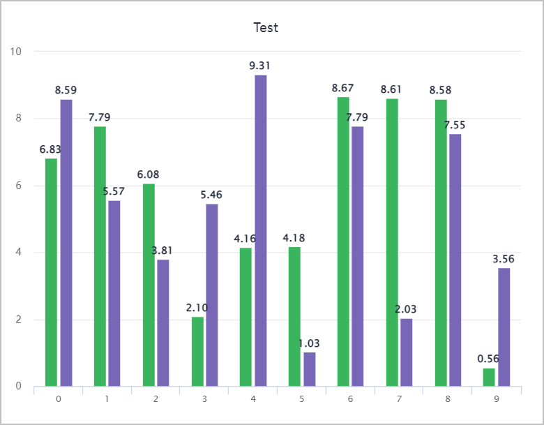
Bar Chart
Often used to compare values at different times or under different conditions.
- Start/end color: The color at the bottom/top of the bar. Together they form a gradient.
- Drill-down column: Add a data field to the bar chart, and then you can click the data point and view more detailed data.
- Overlapped ID: Overlap data columns with the same ID.
- Stack: Stack data columns in ways such as no stacking, general stacking and stacking by percentage.
- Alarm: Set the maximum and minimum values to form an alarm range, and two red lines are displayed on the chart for easy recognition of data out of range.
- Bar width: Set the bar width.
- Rounded corner: Set the radius of rounded corners.
- Grid: Enable it to display grids.
- Coordinate reverse: Reverse the X and Y axis, and a bar chart changes to a horizontal bar chart.
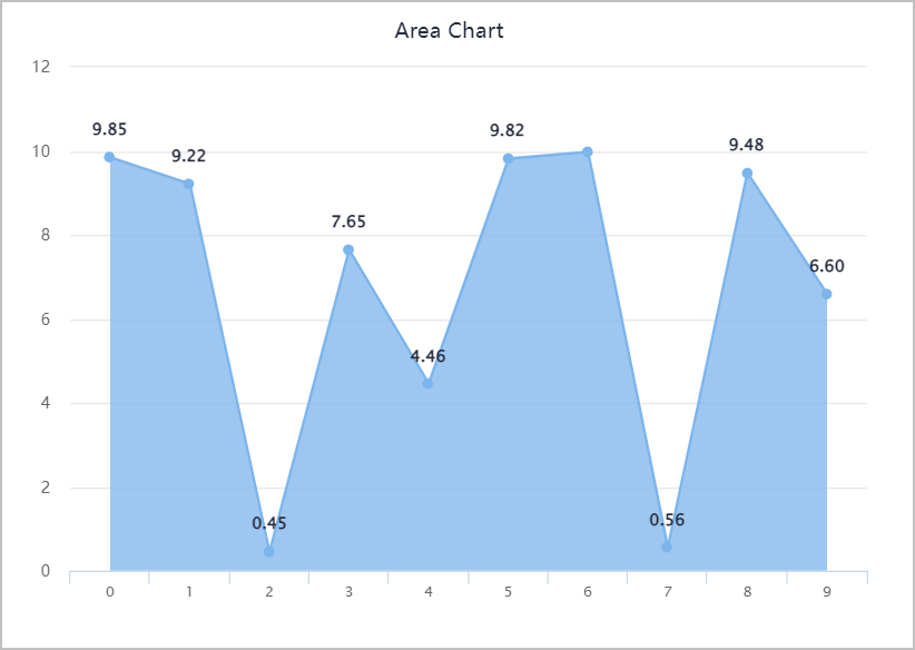
Area Chart
Emphasizes the extent to which the data changes during a period.
- Start/end color: The color at the bottom/top of the area. Together they form a gradient.
- Type: Select the area chart type.
- Stack: Stack data columns in ways such as no stacking, general stacking and stacking by percentage.
- Style: Change line width and type, node icon, size and color.
- Alarm: Set the maximum and minimum values to form an alarm range, and two red lines are displayed on the chart for easy recognition of data out of range.
- Mark max. value: Enable it to highlight the maximum value of the area chart.
- Border: Set the border width, rounded corner radius and color.
- font color/background color: Set the font and background color of the labeled maximum value.
- Grid: Enable it to display grids.
- Coordinate reverse: Reverse the X and Y axis.
Dash Chart
Dash chart binds with numeric real-time data.
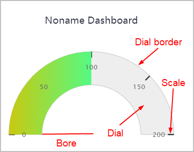
- Start/end color: The color at the bottom/top of the dial. Together they form a gradient.
- Dial color: Set the dial background color.
- Dial border color: Set the color of dial border.
- Dial border width: Set the width of dial border.
- Scale split: Set the number of splits of the dial. The higher the value, the smaller the interval between scales.
- Max/min: Set the maximum and minimum value of the dial.
- Start/end angle: Set angles of the dial start and end scales.
- Scale color: Set the color of the dial scales.
- Font color: Set the color pf dial scale values.
- Dial bore: Set the dial bore.
Speedometer
Speedometer binds with numeric real-time data.
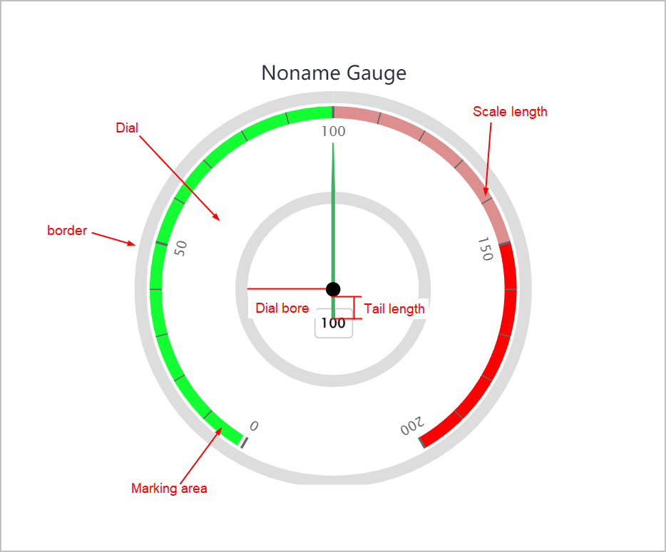
- Dial color: Set the dial background color.
- Dial border color: Set the color of dial border.
- Dial border width: Set the width of dial border.
- Scale split: Set the number of splits of the dial. The higher the value, the smaller the interval between scales.
- Max/min: Set the maximum and minimum value of the dial.
- Start/end angle: Set angles of the dial start and end scales.
- Scale color: Set the color of the dial scales.
- Scale length: Set the length of scale lines.
- Font color: Set the color pf dial scale values.
- Lateral/vertical deviation: The horizontal and vertical position of the dial. 50 means horizontally and vertically centered.
- Marking area: Click Add to add more ranges on which you can add colors and set width to display different level of notifications.
- Origin color/radius: Set color and radius of the origin point.
- Border color/width: Set color and width of the dial border.
- Tail length: Set the tail length of the hand.
- Dial bore: Set the dial bore.
- Display name: Set whether to display the data source value under the origin.
- Connect scale: Set whether to connect the start and end of the speedometer border.
Bubble Chart
Displays data distribution.
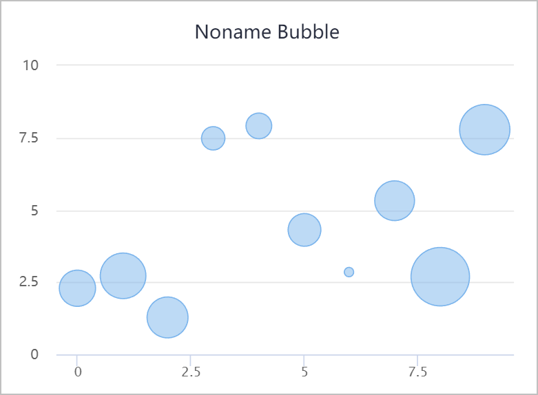
- Bubble size: Select a field to be the bubble size.
- Bubble ratio: Display ratio of bubbles.
- Alarm: Set the maximum and minimum values to form an alarm range, and two red lines are displayed on the chart for easy recognition of data out of range.
- Grid: Enable it to display grids.
Scatter Chart
Displays data distribution.
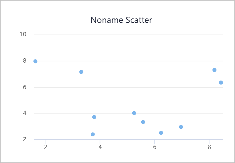
- Bubble size: Select a field to be the bubble size.
- Style
- Point radius: Set the radius of scattering points.
- Connection point: Set whether to connect adjacent points.
- Alarm: Set the maximum and minimum values to form an alarm range, and two red lines are displayed on the chart for easy recognition of data out of range.
- Grid: Enable it to display grids.
- Regression line: Set whether to display the regression line of scattering points.
Pie Chart
Displays the ratio between each section of data and the whole.
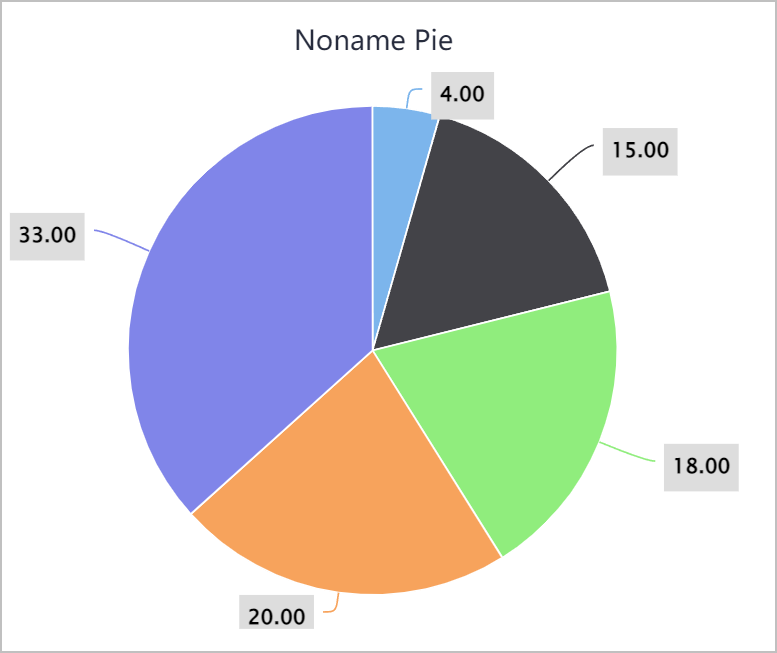
- Type: Select between normal pie chart and pie chart with different section radius based on the data source.
- Style
- Distance: Set the distance between the pie chart and the chart area border.
- Interval: Set the distance between each section of the pie chart.
- Inner radius: Set the radius of the inner circle around the origin.
- Color: Select a color plan for the pie chart.
Funnel Chart
Often used to display the data decreasing. Funnel chart automatically sorts the data, and for different sorting sequence, you can convert the funnel chart to a pyramid.
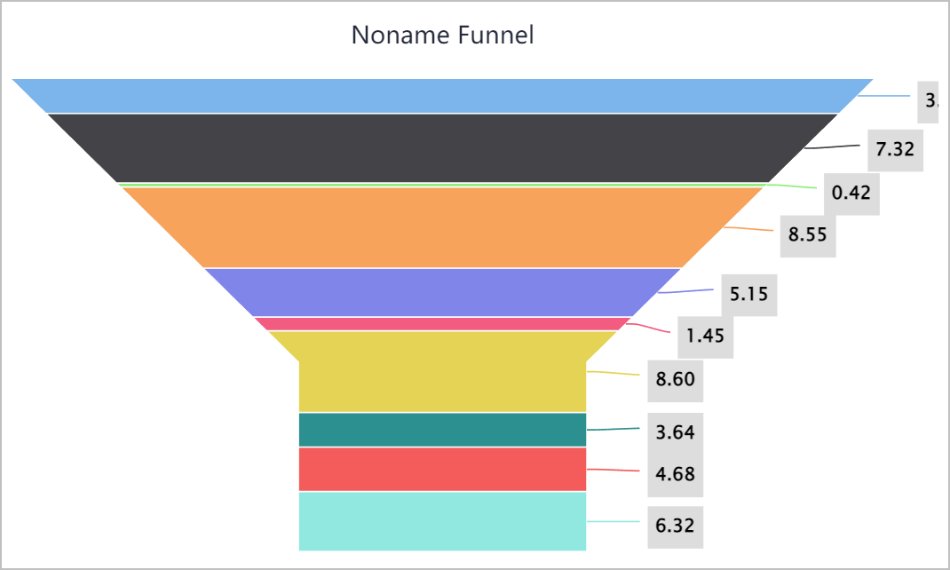
- Type: Select between funnel chart and pyramid.
- Style: Set the width and height of the funnel or pyramid neck.
- Border: Set the border width and color of the funnel chart.
Spider Chart
Mainly used to evaluate each index of a data set. X axis represents index variables and Y axis stands for the distance between the origin to each data point, which indicates the evaluation of each index.
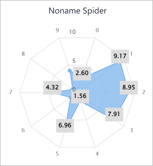
- Style: Set line width, type, node icon, size and color.
- Opacity: Set the opacity of the spider chart.
- Mesh color: Set the color of each spider web line.
Donut Chart
Similar to pie chart. For details, see Pie Chart.
Spc Diagram
Analyzes and judges whether the procedure is stable. The spc diagram has uppr and lower limits.
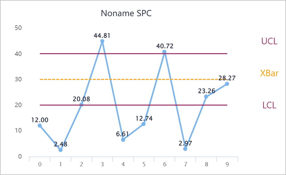
- Line width/style: Set the line width and style such as solid, dotted and more.
- Node size/style: Set the node size and style such as round, square and more.
- Type
- Single-value: Displays history data points.
Part Description Broken line Value of history data points. UCL/LCL Sigma line added 3 to/deducted 3 from mean value. Middle line Numeric average value of a set of data. Node Displays normal and abnormal nodes (consecutive 7 nodes going up or down). API Supports open API and obtain corresponding data from APIs. - Range
Part Description Broken line Absolute value of the difference between the maximum and minimum value. infoYou need to select a mobile parameter n (moving range).
Middle line Numeric average value of a set of data. UCL Sigma line added 3 to mean value. LCL 0
- Single-value: Displays history data points.
- n: Leave it as default.
- Decimal: Set decimal places of the data.
- Abnormal color: Set the marking color of abnormal data.
- UCL: Set the width, color and type of upper limit line.
- XBar: Set the width, color and type of middle line.
- LCL: Set the width, color and type of lower limit line.
- Grid: Enable it to display grids.
Histogram
Accurately displays data distribution. You can distribute data to multiple sections, and integrate data distribution in each section.
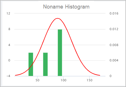
- Alarm: Set the maximum and minimum values to form an alarm range, and two red lines are displayed on the chart for easy recognition of data out of range.
- Grid: Enable it to display grids.
- Fitted line: Set whether to display the fitted line (normal distribution line).
Grid Layout
This section introduces general properties of charts, and for special properties of each chart, refer to specific chapters.
- ID: Automatically generated. You can use it for writing scripts.
- Absolute position: Set fixed width and height, you can move the element anywhere.
- Default position: The element is at the upper-left corner of the column and adapts to screen resolution; Data source
- Fixed width and height/Adapt to window: Select whether to set fixed width and height for the element or let it adapt to actual window it displays on.
- Display level: Set the relative display priority of the element. The higher the level, the more front it is displayed.
- Data source
| Parameter | Description |
|---|---|
| Object Selector | Select properties or services of object instances to be the data source of the chart. info Multiple data sources are available and each data source matches with a set of Y axis configuration. |
| Dimension | X axis field. |
| Data | Y axis field. Click  to add more Y axis fields. to add more Y axis fields. |
| Display Name | The name displayed on data notification prompts in operation center. Object and data source aliases are displayed by default without specific configuration. |
| Data Color | Change the display color of data sources. info If the data source is an object service, make sure to set the return value type to JSON. Otherwise, X/Y axis cannot be customized. |
- Title
| Parameter | Description |
|---|---|
| Title | Select whether to display chart title. |
| Main Title | Set the chart main title. |
| Text Style | Set the main title styles, such as font, font size, color, and more. |
| Alignment | Set the main title alignment. |
| Sub Title | Set the sub title similar to configurations of the main title. |
- Style: Set styles of charts based on specific requirements.
- Legend
| Parameter | Description |
|---|---|
| Legend | Select whether to display chart legend. |
| Position | Set the display position of the legend. |
| Size | Set the legend size. |
| Text Style | Set the legend text style. such as font, size, color and more. |
- X axis
| Parameter | Description |
|---|---|
| X Axis | Select whether to display X axis scales. |
| Type | Select the data of X axis from Categorized and Timeline. |
| Format | Format the X axis data when setting Timeline as Type. |
| Axis Color | Set the line and scale color of X axis. |
| Interval | Set the interval between X axis scales. For example, set it to 5, meaning that an X scale is displayed every 5 pieces of data. |
| Text Style | Set the title text style. |
| Title Position | Set the title position. |
| Vertical Grid | Set the style, color and width of the grid lines. |
- Y axis
| Parameter | Description |
|---|---|
| Axis Font Color | Set the scale value color of Y axis. |
| Title Style | Set the title text style, including font, size, color and more. |
| Y axis-N | Y axis sequence when there are multiple Y axises. |
| Range | Set the range of Y axis. |
| Interval | Set the interval between Y axis scales. For example, set it to 5, meaning that an X scale is displayed every 5 pieces of data. |
| Unit | Set the unit of Y axis scales. |
| Title Position | Set the title position. |
| Alarm | Set the maximum and minimum values to form an alarm range, and two red lines are displayed on the chart for easy recognition of data out of range. |
| Horizontal Grid | Set the styles of horizontal grid lines, including line width, style and color. |
- Background
| Parameter | Description |
|---|---|
| Color | Set the background color of charts. |
| Rounded Corner | Set the value of rounded corners of charts. |
| Border | Set the border style of the chart, including width and color. |
| Padding | Set the distance between data and chart border. |
- Label
| Parameter | Description |
|---|---|
| Display | Set whether to display chart label. |
| Data | Set the data type, value and decimal places of the label data. |
| Font Size | Set the font size of the label. |
| Alignment | Set the label alignment corresponding to the chart. |
| Background | Set the background color, rounded corner, border width and color of the label. |
| Shadow | Set whether to display label shadow. |
- Tooltip
Parameter Description Display Set whether to display tooltip on chart area. Font Size Set the font size of the tooltip. Alignment Set the tooltip alignment corresponding to the chart. Background Set the background color, rounded corner, border width and color of the tooltip. Shadow Set whether to display tooltip shadow.
- Notes
- Display: Set whether to display notes at the lower-right corner of the chart area.
- Content: Enter the note content.
- Interact: Set interaction events, including Click,Load Complete, Click Data Point and Double-click Data Point.
Line Chart
Line charts are often used to display continuous data changes along time. Applicable for viewing data changing trends.
Spline chart is similar to line chart.
- Style: Change line width and type, node icon, size and color.
- Refresh: Refresh the chat by seconds.
- Full screen: Set whether to enable full screen function for the chart. After enabled, you can click the icon to display the chart in full screen in operation center.
- Horizontal display: Enable to switch X and Y axis, and the chart changes to horizontal view.
- Crosshair: Set whether to display crosshairs when mouse moves.
Bar Chart
Often used to compare values at different times or under different conditions.
- Stack: Stack data columns in ways such as no stacking, general stacking and stacking by percentage.
- Rounded corner: Set the radius of rounded corners.
- Refresh: Refresh the chat by seconds.
- Full screen: Set whether to enable full screen function for the chart. After enabled, you can click the icon to display the chart in full screen in operation center.
- Horizontal display: Enable to switch X and Y axis, and the chart changes to horizontal view.
- Crosshair: Set whether to display crosshairs when mouse moves.
Area Chart
Emphasizes the extent to which the data changes during a period.
- Style: Change line width and type, node icon, size and color.
- Refresh: Refresh the chat by seconds.
- Full screen: Set whether to enable full screen function for the chart. After enabled, you can click the icon to display the chart in full screen in operation center.
- Horizontal display: Enable to switch X and Y axis, and the chart changes to horizontal view.
- Crosshair: Set whether to display crosshairs when mouse moves.
Dash Chart
Dash chart binds with numeric real-time data.
- Dial color: Set the dial background color.
- Color of dial, scale lines and values and border can be configured.
- Range: Set the dial range.
- Interval: Set the interval between dial scales. For example, set it to 5, meaning that a dial scale is displayed every 5 pieces of data.
- Angle range: Set angles of the dial start and end scales.
- Scale text style: Set the color pf dial scale values.
- Lateral/vertical deviation: The horizontal and vertical position of the dial. 50 means horizontally and vertically centered.
- Dial bore: Set the dial bore.
- Dial border width: Set the width of dial border.
- Scale length: Set the length of scale lines.
- Full screen: Set whether to enable full screen function for the chart. After enabled, you can click the icon to display the chart in full screen in operation center.
Speedometer
Speedometer binds with numeric real-time data.
- Color of dial, scale lines and values and border can be configured.
- Range: Set the dial range.
- Interval: Set the interval between dial scales. For example, set it to 5, meaning that a dial scale is displayed every 5 pieces of data.
- Angle range: Set angles of the dial start and end scales.
- Scale text style: Set the color pf dial scale values.
- Lateral/vertical deviation: The horizontal and vertical position of the dial. 50 means horizontally and vertically centered.
- Dial bore: Set the dial bore.
- Dial border width: Set the width of dial border.
- Main scale length: Set the length of main scale lines.
- Sub scale length: Set the length of sub scale lines.
- Scales: Set the number of scales of the dial. The dial splits according to the set value.
- Scale deviation: Standard deviation of scales. The higher the value, the bigger the dial.
- Connect scale: Set whether to connect the start and end of the speedometer border.
Bubble Chart
Displays data distribution.
- Full screen: Set whether to enable full screen function for the chart. After enabled, you can click the icon to display the chart in full screen in operation center.
- Horizontal display: Enable to switch X and Y axis, and the chart changes to horizontal view.
- Crosshair: Set whether to display crosshairs when mouse moves.
Scatter Chart
Displays data distribution.
- Full screen: Set whether to enable full screen function for the chart. After enabled, you can click the icon to display the chart in full screen in operation center.
- Horizontal display: Enable to switch X and Y axis, and the chart changes to horizontal view.
- Crosshair: Set whether to display crosshairs when mouse moves.
Pie Chart
Displays the ratio between each section of data and the whole.
- Color: Select a color plan for the pie chart.
- Inner radius: Set the radius of the inner circle around the origin.
- Interval: Set the distance between each section of the pie chart.
- Section ratio: Set the sum of section ratios. It is 100% by default.
- Refresh: Refresh the chat by seconds.
- Full screen: Set whether to enable full screen function for the chart. After enabled, you can click the icon to display the chart in full screen in operation center.
Funnel Chart
Often used to display the data decreasing. Funnel chart automatically sorts the data, and for different sorting sequence, you can convert the funnel chart to a pyramid.
- Type: Select between funnel chart and pyramid.
- Style: Set the width and height of the funnel or pyramid neck.
- Border: Set the border width and color of the funnel chart.
- Refresh: Refresh the chat by seconds.
- Full screen: Set whether to enable full screen function for the chart. After enabled, you can click the icon to display the chart in full screen in operation center.
Spider Chart
Mainly used to evaluate each index of a data set. X axis represents index variables and Y axis stands for the distance between the origin to each data point, which indicates the evaluation of each index.
- Style: Set line width, type, node icon, size and color.
- Refresh: Refresh the chat by seconds.
- Full screen: Set whether to enable full screen function for the chart. After enabled, you can click the icon to display the chart in full screen in operation center.
Donut Chart
Similar to pie chart. For details, see Pie Chart.
Spc Diagram
Analyzes and judges whether the procedure is stable. The spc diagram has upper and lower limits.
- Chart Format
- Individual Value Chart: Displays history data points.
Part Description Chart line Value of history data points. UCL/LCL Sigma line added 3 to/deducted 3 from mean value. XBar Numeric average value of a set of data. Node Displays normal and abnormal nodes (consecutive 7 nodes going up or down). API Supports open API and obtain corresponding data from APIs. - Range Map
Part Description Chart line Absolute value of the difference between the maximum and minimum value. infoYou need to select a mobile parameter n (moving range).
MR Numeric average value of a set of data. UCL Sigma line added 3 to mean value. LCL 0
- Individual Value Chart: Displays history data points.
- Line style: Set the line width and style such as solid, dotted and more.
- UCL: Set the width, color and type of upper limit line.
- XBar: Set the width, color and type of middle line.
- LCL: Set the width, color and type of lower limit line.
- Node style: Set the node size, color and style such as round, square and more.
- Full screen: Set whether to enable full screen function for the chart. After enabled, you can click the icon to display the chart in full screen in operation center.
Histogram
Accurately displays data distribution. You can distribute data to multiple sections, and integrate data distribution in each section.
- Fitted line: Set whether to display the fitted line (normal distribution line).
- Full screen: Set whether to enable full screen function for the chart. After enabled, you can click the icon to display the chart in full screen in operation center.
Progress Bar
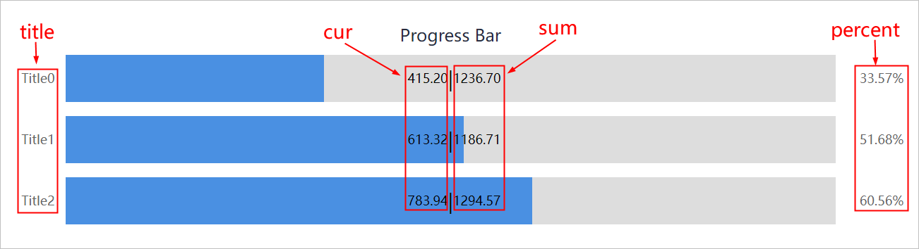
- Data source: Includes title, sum,cur and percent (optional).
- title: Title of each progress bar.
- sum: Data sum.
- cur: Current data value.
- percent: cur/sum = percent.
- Data: Enter the title and color of the progress bar to be displayed.
- Style: Select from horizontal, vertical, waterdrop and circular progress bars.info
Waterdrop and annular progress bars are only for single bar of data display.
Form Library
This section describes general properties of form elements.
- Property
| Parameter | Description |
|---|---|
| Component ID | Automatically generated. You can use it for writing scripts. |
| Component Name | Component name. It cannot be repeated. |
| Required | Set whether it is required. If it is, a red * is displayed in front. |
| Display Level | Set the relative display priority of the element. The higher the level, the more front the chart is displayed. |
| Width/Height | Set the width and height of the element. |
| Display Loading | Set whether to display loading animation in operation center. |
- Interact: Refer to the designing process under each layout for interaction details.
Line
Used only for static display. The line is horizontal by default.
| Parameter | Description |
|---|---|
| Line Direction | Select to display one side line of the rectangle you drew on the canvas after selecting Line from the left side. For example, you used Line element to draw a horizontal line on the canvas, and then set Line Direction to Left, a point on the left side of the line is displayed only. |
| Line Type | Select line types from Solid Line,Point Line,Dotted Line and Double Solid. |
| Line Size | Set the line size. You can click  to reset to defaults. to reset to defaults. |
| Line Color | Set the line color. You can click to reset to defaults. |
Label
Mainly displays text and background.
| Parameter | Description |
|---|---|
| Content Source |
|
| Label Content | Enter the label content when setting Content Source to Static. |
| Dynamic Data | Select a dynamic label data source and relation fields to display when setting Content Source to Dynamic. info Non-relation data cannot be displayed. |
| Display Field | |
| Data Index | Index of returned data. For example, the data is ['a','b','c','d'], when returning 'a', the index is 0, and index is 1 when the returned data is 'b'. |
| Link Object | Configure data linkages through input parameters of the data source. |
| Time Format | Enable it to convert the label content to time format. |
| Font Size | Set size, unit, color, weight, alignment and vertical alignment of the font. |
| Font Unit | |
| Font Color | |
| Font | |
| Bold | |
| Alignment | |
| Vertical Alignment | |
| Border Width | Set label border width. |
| Background Color | Set label background color. |
| Cursor Style | Set cursor style when it hovers over the label in operation center. |
| Required | Set whether it is required. If it is, a red * is displayed in front. |
| Border Color | Set color and type of the label border. |
| Border Type | |
| Padding | Set the distance between data and border. |
Hidden Field
Visible in design center but not in operation center. Hidden area is often used for collecting or sending information and data delivery.
| Parameter | Description |
|---|---|
| Default | Set the default value of the hidden area with a data type of string. |
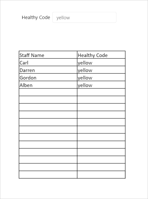
Input Box
As input parameters, often used to be linked with tables or reports for associated query.
| Parameter | Description |
|---|---|
| Title | Enter the input box title. |
| Placeholder | Enter placeholder of the input box. |
| Title Width | Set the title width, font size, font and color. info Title automatically wraps when exceeding the set width. |
| Title Size | |
| Title Color | |
| Title Font | |
| Content Size | Set size, color and font of entered text in the box. |
| Content Color | |
| Content Font | |
| Background Color | Set background color of the element. |
| Border Width | Set width, color and type of the border. |
| Border Type | |
| Border Color | |
| Verification Time | Set whether to apply verification to the element and time. |
| Format | Data format of the input box. The supOS platform verifies the format based on the set verification time. |
| Multi-line | Select input text lines between Single Line or Multi-line. |
| Box Type | Set width, color and type of the input box border. |
| Box Color | |
| Box Width | |
| Background Color | Set background color of the input box. |
| Max. Length | The maximum length of entered text. |
| Read Only | Set the read and write status of the element. When set to Read Only, you cannot edit it in operation center. |
| Fix on Top/Right/Bottom/Left | Fix the element position based on its size and top/right/bottom/left edge, and it does not change due to resolution or page position changes. |
Drop Down Box
As input parameters, often used to be linked with tables or reports for associated query.
| Parameter | Description |
|---|---|
| Title | Enter the input box title. |
| Placeholder | Enter placeholder of the input box. |
| Title Width | Set the title width, font size, font and color. info Title automatically wraps when exceeding the set width. |
| Title Size | |
| Title Color | |
| Title Font | |
| Content Size | Set size, color and font of entered text in the box. |
| Content Color | |
| Content Font | |
| Background Color | Set background color of the element. |
| Border Width | Set width, color and type of the border. |
| Border Type | |
| Border Color | |
| Verification Time | Set whether to apply verification to the element and time. |
| Options | Select data source between Static or Dynamic.
|
| Multi Selection | Whether to enable multiple selections. |
| Read Only | Set the read and write status of the element. When set to Read Only, you cannot edit it in operation center. |
| Fix on Top/Right/Bottom/Left | Fix the element position based on its size and top/right/bottom/left edge, and it does not change due to resolution or page position changes. |
Cascade Selection
Provides related data sets for selection.
| Parameter | Description |
|---|---|
| Title | Enter the input box title. |
| Title Width | Set the title width, font size, font and color. info Title automatically wraps when exceeding the set width. |
| Title Size | |
| Title Color | |
| Title Font | |
| Content Size | Set size, color and font of entered text in the box. |
| Content Color | |
| Content Font | |
| Background Color | Set background color of the element. |
| Border Width | Set width, color and type of the border. |
| Border Type | |
| Border Color | |
| Verification Time | Set whether to apply verification to the element and time. |
| Data Source | Bind an object service for data display. |
| Read Only | Set the read and write status of the element. When set to Read Only, you cannot edit it in operation center. |
Radio and Checkbox
Contains multiple options. You can only select one option when it is a radio element, and can select multiple options when it is a checkbox.
- Property of radio
| Parameter | Description |
|---|---|
| Title | Enter the input box title. |
| Placeholder | Enter placeholder of the input box. |
| Title Width | Set the title width, font size, font and color. info Title automatically wraps when exceeding the set width. |
| Title Size | |
| Title Color | |
| Title Font | |
| Content Size | Set size, color and font of entered text in the box. |
| Text Color | |
| Content Font | |
| Border Color | Set border color of the element. |
| Verification Time | Set whether to apply verification to the element and time. |
| Button Style | Enable it to display options as buttons, |
| Vertical Alignment | Set radio options to align vertically. |
| Button Background | Set the button background color. |
| Selected Button Color | Set the button background color when it is selected. |
| Selected Text Color | Set the option text color when it is selected. |
| Options | Select data source between Static or Dynamic.
|
| Link Object | Configure data linkages through input parameters of the data source. |
| Read Only | Set the read and write status of the element. When set to Read Only, you cannot edit it in operation center. |
| Fix on Top/Right/Bottom/Left | Fix the element position based on its size and top/right/bottom/left edge, and it does not change due to resolution or page position changes. |
- Properties of checkbox: Refer to the table above. Other properties are listed as follows:
- Background Color: Se the option button color.
- Select All: Set whether to display Select Alloption.
- Checkbox: Set whether to display checkboxes. Without it, you can directly select option text.
- Linkage: For data linkage in free layout, see Data Linkage, and in grid layout, see Data Linkage.
Date Picker
As input parameters, often used to be linked with tables or reports for associated query. Input format can be date, time or date and time.
In free layout , the element is Date and in grid layout, it is Date Picker. Their functions are the same.
| Parameter | Description |
|---|---|
| Title | Enter the input box title. |
| Title Width | Set the title width, font size, font and color. info Title automatically wraps when exceeding the set width. |
| Title Size | |
| Title Color | |
| Title Font | |
| Content Size | Set size, color and font of entered text in the box. |
| Content Color | |
| Content Font | |
| Background Color | Set background color of the element. |
| Border Width | Set width, color and type of the border. |
| Border Type | |
| Border Color | |
| Verification Time | Set whether to apply verification to the element and time. |
| Date Type | Select the date type and format. |
| Date Format | |
| Default Value | Set default value when setting Date Type to Date. |
| Initial Value | Set the initial date. It can be empty. |
| Read Only | Set the read and write status of the element. When set to Read Only, you cannot edit it in operation center. |
| Fix on Top/Right/Bottom/Left | Fix the element position based on its size and top/right/bottom/left edge, and it does not change due to resolution or page position changes. |
Button
Triggers click events, such as click to search and click to open another page.
Property Configuration
| Parameter | Description |
|---|---|
| Button Title | Enter the input box title. |
| Title Size | Set the title font size, color, weight and type. |
| Title Color | |
| Bold | |
| Title Font | |
| Width/Height | Set the width and height of the element. |
| Border Width | Set width, color and type of the border. |
| Border Type | |
| Border Color | |
| Corner Radius | Set the radius of button rounded corners. |
| Button Icon | Select whether to display icons before button title and the icon. |
| Custom Icon | Customize icon. |
| Icon Position | Set position and size of the icon. |
| Icon Size | |
| Background Color | Set background color of the element. |
| Hide when Print | Enable it to hide the button when printing. |
| Unavailable | Set whether to make the button unavailable. After enabled, it will be grayed out. |
| Fix on Top/Right/Bottom/Left | Fix the element position based on its size and top/right/bottom/left edge, and it does not change due to resolution or page position changes. |
Button Group Configuration
By switching between multiple buttons, you can use one process workflow or graphic group to display different data.
The button group function is only available for graphic elements.
- Select graphic elements and then set their dynamic effects. For details, see Dynamic Effect.
- Select those graphic elements, and then right-click to group them.
- Add a button on the canvas.
- Click the button, and then click Configure Point Groups under Interact.
- Click Configure in the pop-up window, and then select a data source to replace the original one. Do the same for multiple buttons.

- After configuration, you can click different buttons to view corresponding data and dynamic effects in operation center.
Tree
Displays hierarchical relations between equipment. Generally the tree element is used together with factory models. You need to write script for each node on the tree to link with designed pages.
Make sure you have installed factory model APP in the supOS platform before binding a tree element with a factory model.
| Parameter | Description |
|---|---|
| Title | Enter the input box title. |
| Search Box | Whether to add a search box for the tree element. |
| Collapse | Whether to collapse the tree when opening the page in operation center. |
| Select by Default | Whether to select the root node of the tree by default. |
| Selected Background | Set background color of a tree node when it is selected. |
| Selected Text Color | Set text color and size of a tree node when it is selected. |
| Selected Text Size | |
| Data Source | Displays data by binding a factory model or object service. |
| Cancel Permission | Enable it, and the tree node content is not restricted by data group management permission under User Security Management. |
| Fix on Top/Right/Bottom/Left | Fix the element position based on its size and top/right/bottom/left edge, and it does not change due to resolution or page position changes. |
Single List
Switch and display multiple pages in the form of parallel menus.
| Parameter | Description |
|---|---|
| Title | Enter the input box title. |
| Title Size | Set the title font size, font and color. |
| Title Color | |
| Title Font | |
| Border Width | Set width, color and type of the border. |
| Border Type | |
| Border Color | |
| Line Height | Set the line height of the single list. |
| Selected Color | The background color when the list is selected. |
| Background Color | Set background color of the element. |
| Confirm Icon | Whether to display the confirm icon before the list. |
| Custom Icon | Customize the confirm icon. |
| Data Source | Bind an object service for data display. |
| Link Object | Configure data linkages through input parameters of the data source. |
| Field Binding | Bind a field in the data source of an element on the canvas, and display it on the list. |
| Field | Select a field to be bound for display on the list. |
Table
Displays large amount of structured data and often linked with buttons, input boxes for data linkage. The data source can be database tables or services of the bound object properties. You can integrate, search for and export important system and on-site data.
Data inside table cells can be links, buttons, images or time.
- Property
| Parameter | Description |
|---|---|
| Title | Enter the table title and set the title font size and color. |
| Font Size | |
| Font Color | |
| Required | Set whether it is required. If it is, a red * is displayed in front. |
| Fixed Header | Freeze the table head. |
| Column Adjustment | Enable it, and then you can adjust the column width in operation center and the width will return to default after refresh. Only manual adjustment is available. |
| Selectable | Select it to add a checkbox in front of the first column. |
| Border | Set whether to display the inner border of table cells. |
| Outline | Set whether to display the table outline |
| Outline Type | Set width, color and type of all borders. |
| Outline Color | |
| Outline Width | |
| Display Head | Set whether to allow user to adjust head field display and field sequence. |
| Head Background | Set the background color of the table head. |
| Font Color | Set the font color. size, type and weight of the table head. |
| Font Size | |
| Font | |
| Bold | |
| Table Background | Set the background color of the table body. |
| Font Color | Set the font color. size and type of the table body. |
| Font Size | |
| Font | |
| Table Height | Set the table cell height. |
| Odd Line Color | Background color of odd lines in the table. |
| Even Line Color | Background color of even lines in the table. |
| Fix on Top/Right/Bottom/Left | Fix the table position based on its size and top/right/bottom/left edge, and it does not change due to resolution or page position changes. |
| Scroll Bar Background | Select the scroll bar background. |
| Scroll Width | Set the table width, and a scroll bar appears when the element width is exceeded. |
| Data Source | Bind an object property or service for data display. |
| Pagination | Set whether to display data in multiple pages. |
| Lines Per Page | When data is displayed in multiple pages, set the number of data columns in each page. |
| Export | Enable it, and then an export button and toolbar are displayed on the table. You can export the selected range of table data. |
| Import | Enable it, and then an import button and toolbar are displayed on the table. You can export the template before import. info
|
| Import/Export Style | Select the export and import icon from image or button. |
| Toolbar Color | Set the background color of table toolbar. |
| Link Object | Configure data linkages through input parameters of the data source. |
| Head Config | Set the table head content that is linked with the data source field. Click New or the drop-down box after linking data source (fields) to add table head. |
| Field | Field name of the table head, must be the same as that of the data source. |
| Display Name | Name of the table head. |
| Width | Set the column width where the current field belongs. All columns are split evenly when it is empty. |
| Alignment | Set the alignment of table data. |
| Tips | Set whether to display tips. When it is enabled, hover over a cell where cell content exceeds the cell width, you can see a tip window that displays the full content. |
| Data Type | Select data type of the column. |
| Data Rendering | Enter functions to render original data. Input parameters can be text (current data), row (current row), index (subscript of current row), table (all data of current table). For example, |
| Filter | Enable filter and a filter icon is displayed on the table. When the bound data source is a form template, fuzzy match is applied, and for object services, results are subject to the script. info If a field configured with data linkage is filtered, the results are subject to filter conditions. |
| Sorting | Enable it and then you can click table head to sort the column. Only available when data source is a form template. |
| Timed Refresh | Enable it and the table data refreshes at the set frequency. |
| Refresh Frequency | Set the frequency at which the table data refreshes. |
- Data linkage: For details, see Data Linkage.info
When the data source is object services, you need to set input parameters when configuring service. For details, seeFactory Modeling.
Picture
Uploads pictures for display. General image types are supported and you can directly drag them to the designer.
| Parameter | Description |
|---|---|
| Type | Select between picture and pure color. |
| Upload | Upload new pictures one by one or in batches and they are automatically saved to static resources. You can delete uploaded pictures one by one but cannot delete picture directory. info Pictures are exported when exporting APP for easy migration, and when exporting a page, pictures on the page will not be exported. |
| Picture URL | Automatically generated when uploading pictures. You can also manually enter corresponding URL. |
| Aspect Ratio | Select the background image display.
|
| Read Only | Set the read and write status of the element. When set to Read Only, you cannot edit it in operation center. |
Bookmark Page
Used for switching between multiple tabs.
| Parameter | Description |
|---|---|
| Options | Select data source between Static or Dynamic.
|
| Link Object | Configure data linkages through input parameters of the data source. |
Upload
Set the interaction event of the element to Upload Complete, and write corresponding script. In operation center, you can directly click the Upload button to upload files.
| Parameter | Description |
|---|---|
| Title | Enter the element title. |
| Multi Select | Whether to allow user to upload multiple files at one upload. |
| Display List | Whether to display the list of uploaded files. |
| Upload Type | Types of files that can be uploaded. |
| List Type | Styles of uploaded file list. |
| Max. Upload | The maximum number of uploading files. The default is unlimited. |
| Read Only | Set the read and write status of the element. When set to Read Only, you cannot edit it in operation center. |
Bread Crumbs
Displays the current page hierarchy. Generally used in multi-level navigation.
Bread crumbs depend on script configuration to render and interaction events to interact.
Search
Allows user to search for contents in need. Fuzzy match is available.
| Parameter | Description |
|---|---|
| Data Port | Data source port of the element. It can be Object Service or Data Link. |
| Request Address | Port address called by the element. |
| Request Method | Request method corresponding to the request address. |
| Search Field | Key of search field and search result field, and number of search results that corresponds to the request. |
| Item Field | |
| Display Volume | |
| Display Field | The corresponding field of search results. |
| Field Value | The actual value of the current selected search result. |
| Title | Enter the element title. |
| Placeholder | Enter placeholder of the search box. |
| Title Width | Set the title width, font size, font and color. info Title automatically wraps when exceeding the set width. |
| Title Size | |
| Title Color | |
| Title Font | |
| Border Type | Set width, color and type of the border. |
| Border Color | |
| Border Width | |
| Background Color | Set background color of the element. |
Make sure the corresponding fields used in request address, method, search field, item field, display volume, display field, field value and the called port are the same.
Time
Displays the current time.
| Parameter | Description |
|---|---|
| Text | Set the font, font size and color of the time. |
| Format | Display format and mode of time. |
| Background | Background color, rounder corner angle, stroke width and color of the element. |
| Border | Rounded corner, width and color of the border. |
Date
Displays the current date. Only available in grid layout.
| Parameter | Description |
|---|---|
| Language | Select between Chinese and English. |
| Format | Display format of date. |
| Text | Set the font, font size and color of the date. |
| Background | Background color, rounder corner angle, stroke width and color of the element. |
Controls Library
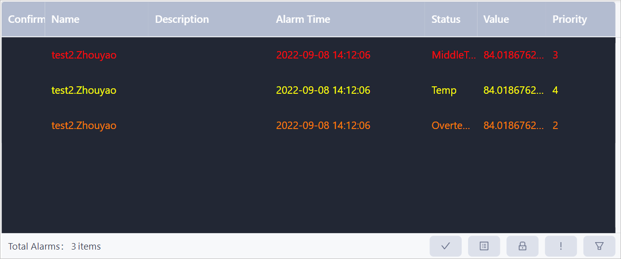
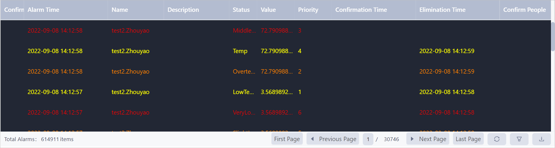
Real-Time Alarm and History Alarm
Both alarm elements automatically link with the set alarms in object instances.
- Real-time alarm: When an alarm is triggered, you can confirm the alarm information in operation center.
- History alarm: You can view all history alarms in time descending order.
Drive Video and H.265 Video
Displays real-time video and video playback is available.
Only one H.265 video element is support on one page.
Property Configuration
- Component ID: Automatically generated. You can use it for writing scripts.
- Real time video:
- Auto play: Automatically plays the video when opening the page.
- Video cycle: Add 5 video sources at most to play them repeatedly in the set period.
- Collector: Select the collector that delivers the set video source.
- Video object: Select the object instance of real-time video.
- Playback: You can select video sources different from that of real-time video.
- Collector: Select the collector that delivers the set video source.
- Video object: Select the object instance of playback video, and the corresponding collector source type is HCNETSDK.
Configuration Process
- Configure source points and tags of video drive types in collector software.
- Object instances with the same name as collector tags are automatically generated in supOS platform.
- In business designer, select corresponding object instances to be data sources bound with video elements.
video Wall
Binds with multiple video elements and arranges them. You can switch real-time video and history video on each video element in operation center.
H.265 video sources are not supported.
- Property
- Component ID: Automatically generated. You can use it for writing scripts.
- Layout: Set the layout of the bound video sources.
- Title
- Display: Display or hide the video wall title.
- Title: Set the video wall title.
- Text style: Set the font, size, color, weight and style of the title.
- Alignment: Title alignment.
- Background color: Title background color.
- Real time: Same as Drive Video.
- Playback: Same as Drive Video.
Timer
| Parameter | Description |
|---|---|
| Component ID | Automatically generated. You can use it for writing scripts. |
| Component Name | Component name. It cannot be repeated. |
| Time Interval | Timer interval. The default is the timer refreshes every second. |
| Immediate Run | Run the script after elements load completely. |
| Run Times | Set the times of running the script. If Immediate Run is enabled, it takes up one run time. |
| Script | The system provides refresh script. You can also customize. |
Trend
Binds multiple data sources and records data points at a set time interval to form a trend chart. The trend is dynamically refreshed.
In free layout, trend parameters configured in operation center are saved, but not in grid layout.
| Parameter | Description |
|---|---|
| Component ID | Automatically generated. You can use it for writing scripts. |
| Data Source | Select a numeric data source. You can select up to 8 data sources and configure different line styles and colors for them. |
| Upper Limit/Lower Limit | Based on the set alarm value of the data source, on the trend chart, the upper and lower limit are displayed in red. info If there are multiple sets of alarm rules, the upper limit takes the lowest value and the lower limit takes the highest. |
| Single Y Axis | Enable it to display only one range of Y axis and it integrates all data sources, meaning the upper/lower limit of a single Y axis is the highest/lowest limit from all data sources. info When it is disabled, ranges of all data sources will be displayed on the Y axis interchangeably according to the current selected data source. |
| Axis Color | Set Y axis color when Single Y Axis is enabled. |
| Range Adaptation | The Y axis adapts its range according to tags value. |
| Y Axis Value | Select from Quantity and Percentage. Percentage converts from quantity automatically. |
| Time Period | Time period that the trend chart covers. The default is 8 hours. |
| Display Toolbar | Enable it to display toolbar. |
| Display Mode | Select to display multiple properties that are currently opened in tiles or lists. info By default, only two rows are displayed, and you can scroll to view more. |
| Colors | Set colors of background, table, border and slide bar. |
To Do List
Automatically links with workflows of the current APP, and you can manage all your to-do items through this element.
List Description
- To Do: Displays to do tasks of user.
- Submitted: Displays tasks submitted by user.
- Initiated: Displays tasks initiated by user and the current progress can be viewed.
- Concerned: Displays tasks concerned by user and the current progress can be viewed.
- Entrusted: Displays tasks entrusted by user and it can be cancelled.
Data Configuration
You can set the content displayed on each list. The table below takes to do list as an example.
 : Display the corresponding item on the list.
 : Set the font, font color and size of the corresponding field, and whether to prompt.
- Add custom property: Display other custom properties of the APP on the list. Make sure to enter Component ID of an element on the APP in Value box to link corresponding data.

Property Configuration Configure element styles of the to do list.
| Parameter | Description |
|---|---|
| Component ID | Automatically generated. You can use it for writing scripts. |
| Component Name | Component name. It cannot be repeated. |
| Articles per Page | Set the number items displayed on each page. |
| Border | Set whether border exists and its width, color and type. |
| Border Type | |
| Border Color | |
| Border Size | |
| Head Background | Set the background color of the table head. |
| Font Color | Set the font color. size and type of the table head. |
| Font Size | |
| Font | |
| Table Background | Set the background color of the table body. |
| Font Color | Set the font color. size and type of the table body. |
| Font Size | |
| Font | |
| Odd Line Color | Background color of odd lines on the list. |
| Even Line Color | Background color of even lines on the list. |
Report
Data sources of report element can be object instances, templates, service real-time data or relational database, and database can either be from third-party or manually creation. The report element is often linked with buttons, search boxes, input boxes to search for and export important data.
Property Configuration
- Property
Parameter Description Component ID Automatically generated. You can use it for writing scripts. Component Name Component name. It cannot be repeated. Fill Type - Replace: Original data is replaced when filling the bound data source.
- Insert: A new column or row is added when filling the bound data source.
Scroll Bar Set display mode of the scroll bar. When setting to Automatic, data inside the report exceeds the element width and the scroll bar is displayed. Fix on Top/Right/Bottom/Left Fix the element position based on its size and top/right/bottom/left edge, and it does not change due to resolution or page position changes. Run Edit You can edit the report in operation center. Often used when you need to fill in the report. Zoom (Small)/Zoom (Large) Font size in the report adapts to the resolution when it increases/decreases. Sheet Page Displays sheets on the bottom. Background Color Set background color of the element. - Parameter: Input parameters of the report. Insert sql commands or object services into the report in design center, and then you can link the report with other elements through sql commands or input parameters of services. For details, see Report Linkage.
- Mobile: Set the display mode of the report on mobile clients, and it adapts to the client resolution.
- Interact: Refer to the designing process under each layout for interaction details.
Toolbar Configuration
Functions of the report are similar to excel and only special features are listed in this section.

- Cell Format: Aside from general functions, under Authority tab, you can grant different permissions of the selected cells to different users in operation center, such as read only, read and write and hide.
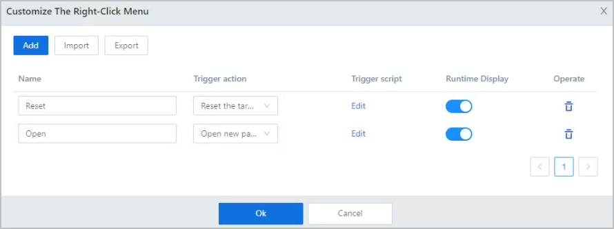
- Right-Click Menu: Click the Customizetab, and then click Right-Click Menu to add options to a right-click menu on the report.
You can select actions and edit its script, import, and export the menu to JSON file and call it in other report elements.
- Event Extensions: Click the Customize tab, and then click Event Extensions customize events such as edit cell, click and finish editing.
You can export the event to JSON file and call it in other report elements.
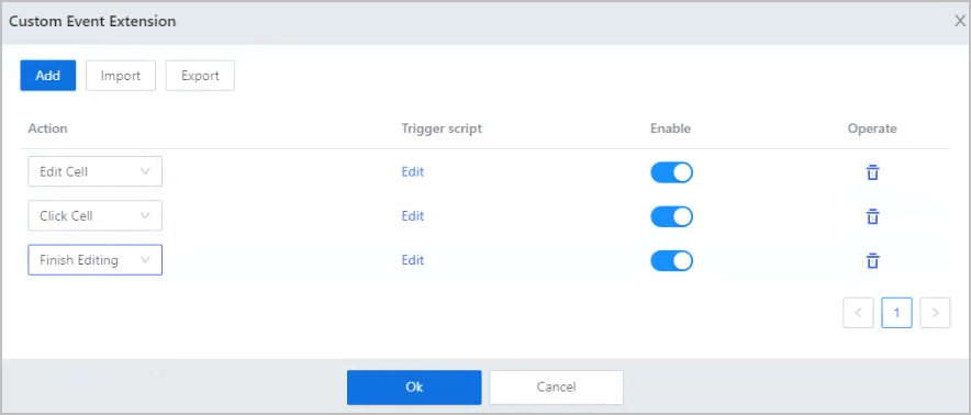 infoRight-Click Menu and Event Extensions are only available in grid layout.
Data Source Management
Add object instances, templates, services or data query commands, and then you can directly drag corresponding properties, fields or parameters into the report.
A key field is generated after adding object data. It adds a column of index number for those data. Time series data will not generate key.
Add Object Instance
You can add object template, instance and service by selecting  > Object Instance under Data Source Management.
Data type can be real-time and history.
> Object Instance under Data Source Management.
Data type can be real-time and history.
- Only the first 200 properties can be displayed of each instance. You can right-click the cell, select Insert Formula > Data Source to add more.
- Right-click a cell and select Insert Formula > Built-in Function, enter related information to add a date function to the cell.
- Add object instance
- Select > Object Instance under Data Source Management.
- Select an object instance under the Object instance-property tab in the pop-up window, and then click Save.
- Drag the added instance from the list to the report, and then select the cell, configure its properties under Property Configuration at the lower-right corner.

Parameter Description Display Type Select whether to display time or value of the history data in the cell. Time Granularity Time interval at which the history data is integrated and analyzed. Numeric Type Select calculation methods which are applied to the data collected according to the set Time Granularity. Fill Type Select the data to fill in the report. - Autofill: Select fill direction and maximum number (1-500) of data to be displayed.
- Fixed: Get the data of a fixed index from 1 to 500.
- Select
- Add object property or service
- Select > Object Instance under Data Source Management.
- Select an object property or service under the Object Template or Object Instance-Service tab in the pop-up window, and then click Save.
- Drag the added property or service from the list to the report, and then click the cell, configure its properties under Property Configuration at the lower-right corner.
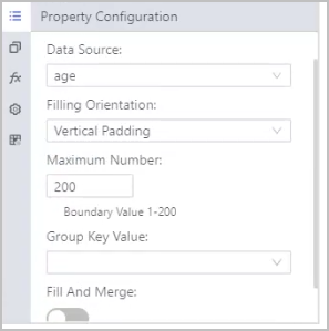
Parameter Description Data Source Switch to other output parameters of the data source. Filling Orientation Select data filling direction. Maximum Number The maximum number of data that can be displayed. It ranges from 0-200. Fill and Merge Enable it and then when filling a cell, adjacent cells on the filling direction will be merged together.
- Select
Add Data Query
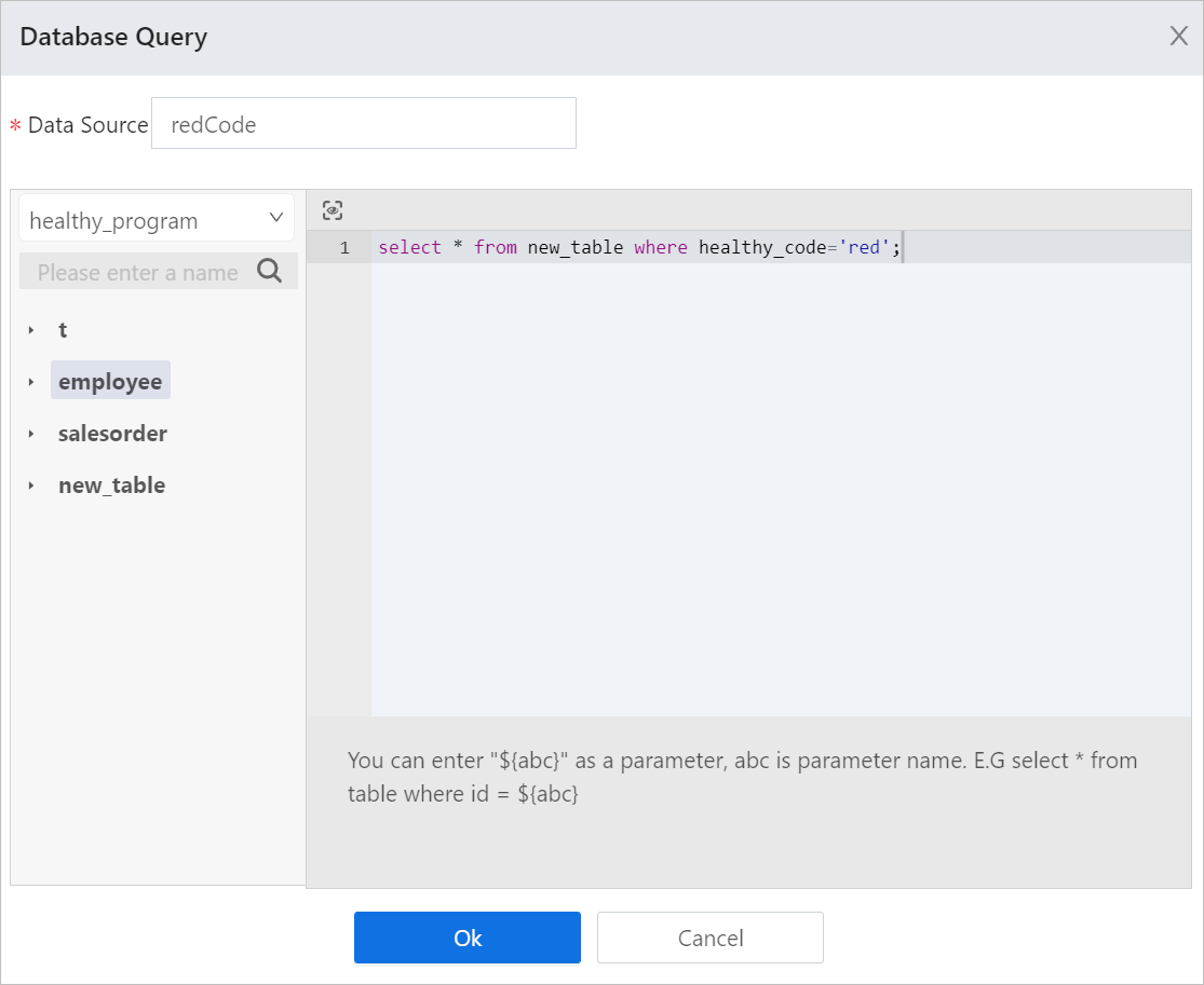
Search results of third party data sources such as mysql, oracle, sqlserver and AHNA.
- Select > Data Search under Data Source Management.
- Select a data source from databases that have been added under Global Configuration.
- Enter SQL commands.You can preview search results.info
${param} can be used as a unspecific parameter when entering SQL commands. Make sure the ${param} is displayed the same as the real parameter. For example, the original parameter is 'zhangsan' (string), and the command can be
select * fromtablename where user='$param'. - Enter Data Source Name as the data set for search results.
- Click OK, and then the result data set is displayed under Data Source Management.
- Drag a field to the report, and then click the cell to configure properties.
Parameter Description Assign Primary Key Set a filed in the table to be the primary key. You can also select and combine multiple fields to be a primary key to ensure its uniqueness. Type Conversion Convert time data in Oracle. Placeholder $$ is used as column name, and $$$ is value. tipInput format example
to_timestamp($$$,’yyyy-MM-dd HH24:MI:ss.ff’): Single cell conversion of data type.cast($$ as decimal(10,2)): Columndata type conversion.
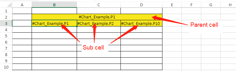
Parent Cell Bind the selected cell with custom parent cell.
- Set one parent cell: Set only one parent cell, the sub cells copy filling direction and number of parent cell and the relative position stays the same.
- Set both cells: Data generated on sub cells will be filtered according to its parent cell to produce result sets that conform to report logics.
- Set the Fill Type of the report to Insert.
- Select a cell to be the sub cell, and then select Customize under Left Parent Cell.
- Select a parent cell for the set sub cell, and enter the cell row and column number.
Generally, select a parent cell with formulas, such as formulas of history data, table data, service data and date function.
 info
infoAfter setting parent cells, data on the table is automatically deduplicated and reorganized evenly. No relations between columns by default and relational data can only be correctly displayed after parent cell settings.
Aggregation Formula
Calculate cells set with formulas.
- Drag data into a cell, and set the Data Type to History Data under Property Configuration.
- Select another cell, and then set a formula to it which relates to the cell with history data.
- Click Aggregation Formula at the lower-right corner.
- Select Customize, and then enter the location of the cell with a formula.

- Save settings, and then click Preview.
You can see the cell with a formula is displaying calculation results of corresponding formula and hirtory data.
Operation
You can update and delete data in relational database through setting a cell as a save or delete button under Operation.
- Select an empty cell on the report, select Data Search and enter sql commands to obtain a data source for the cell with execution results.
For details, see Data Source Management.
- Select another empty cell to be the operation button.
- Click Operation at the power-right corner, and then set the operation.info
The operation button can only be correctly displayed after setting it parent cells.

Parameter Description Table Name The table name corresponding to fields you want to change. Data Source The data source corresponding to fields you want to change. Operation Type - Renew: You can save the edited cell in operation center.
- Delete: You can delete the selected cell in operation center.
Operating Range Select ranges for the operation to apply to. Text The text for the operation button. - Select Format > Cell Format > Authority on the report, and then grant read and write permission of the selected cell to users.

- Enable Run Edit for the report under Property.
- Save settings, and then click Preview.
Now you can update or delete the report data by operation buttons.
infoIf the primary key of the data source is changed and saved, you need to refresh the current page for further changes.
Report Linkage
You can link the report to other elements such as button, search box and input box to integrate, search for and export important data. In the report, each data source has a corresponding linkage button.
This chapter demonstrates data linkage of report in free layout.
- History Data Linkage
According to the linked date element range, the report displays corresponding history data.
- Add a data source.
- Add two date elements and set them to start and end date respectively.info
Make sure to change the name of both elements. Otherwise, they cannot be bound to the report.
- Select the report and then click Open next to Date Binding under Parameter.
- Bind minDate and maxDate to corresponding start and end date elements, and then click Save.

- Form Data Linkage
This section uses Data Search to be the data source as an example.
- Double-click the report, and then under Data Source Management, click Data Search to add a data source with the result of the sql commands.
Write a sql command and use
${"{"}parameter{"}"}as the input field that can link with the report.
- Drag data fields to the report, and then save the table and go back to the page canvas.
- Add an input box to the canvas, and the click Open next to the data source name you set after writing sql commands, to link the input box to the report.

- Click Save, and then preview the page.
Enter a parameter in the input box, and then the report displays data filtered based on the input content.
Report Group
Group the report to display data by time or field.
Available in grid layout only.
- Drag object properties to cells from the data source list, and then set cells that contain the property based on which the report data is grouped to be the parent cell and join them.
- Use the parent cell data as the general time period, set its property at the lower-right corner.
- Set Data Type to History Data.
- Set Display Type to Display Time.
- Set Time Granularity to 1 Week.
- Set Group Key Value to Time.
- Set Fill Type to Autofilland Filling Orientation to Horizontal Padding.

- Similarly, set the property of the first sub cell, which is the time period of groups.
- Set Data Type to History Data.
- Set Display Type to Display Time.
- Set Time Granularity to 1 Day.
- Set Group Key Value to Time.
- Set Fill Type to Autofilland Filling Orientation to Vertical Padding.
- Set the property of the second sub cell, which is the average flow.
- Set Data Type to History Data.
- Set Display Type to Display Value.
- Set Time Granularity to 1 Day.
- Set Numeric Type to Average Value.
- Set Group Key Value to Time.
- Set Fill Type to Autofilland Filling Orientation to Vertical Padding.
- Set the property of the third sub cell, which is the maximum temperature.
- Set Data Type to History Data.
- Set Display Type to Display Time.
- Set Time Granularity to 1 Day.
- Set Numeric Type to Maximum Value.
- Set Group Key Value to Time.
- Set Fill Type to Autofilland Filling Orientation to Vertical Padding.
- Save settings and then click Preview.
Related Operations
- Print Report
Add a button in the design center, add a click event and write a script for the button to print the report in the operation center.
var report = scriptUtil.getRegisterReactDom('
{component ID}').report;{"\n"}report.doPrint();
- Export Report
Add a button in the design center, add a click event and write a script for the button to export the report in the operation center.
var report = scriptUtil.getRegisterReactDom('
{component ID}').report;{"\n"}
report.doExport('xlsx');
- Filter Report
Advanced filter for service or relational data. You can add one or more filtering conditions to view the filtered data in the operation center.
- Select a cell with data, and then select Filter > Advanced Filter from the toolbar.
- Set filtering conditions in the pop-up window.
- Select whether to apply filtering conditions of the parent cell to the selected cell. If applied, the result conforms to filtering conditions of both cells.info
This is only available when both cells using data from the same data set.
- Select condition types.
- General: Define filtering conditions to data columns.
- Formula: Use formulas to set filtering conditions. Presently not available.
- Set filtering conditions, and then click OK.
You can add more conditions and set their relations.

- Select whether to apply filtering conditions of the parent cell to the selected cell. If applied, the result conforms to filtering conditions of both cells.
Web Page
Displays other web pages, design pages through property or service and supOS static resource links. You can also link the web page with other elements to display different page contents.
| Parameter | Description | |
|---|---|---|
| Basic Settings | Component ID | Automatically generated. You can use it for writing scripts. |
| Position | Position of the element. | |
| Size | Width and height of the element. | |
| Title | Set the content, font, color and margin of the web page title. | |
| Web Page | Url | Set the element url. |
| Sandbox | Whether to enable a sandbox to test the web page. | |
| De-Iframe | Enable it and the set pop-up windows are prompted in local browser; if disabled, they are prompted inside the element. | |
| Margin | Set the margin and padding of the element. | |
| Padding | ||
| Background | Background color of the web page. | |
| Border | Border color, style and width of the web page. | |
| Data Source | Set web page address by binding object property or service. Format is {url:'address link'}. | |
| Linkage Object | Configure data linkages through input parameters of the data source. | |
Carousel
Binds multiple web pages or images by url and play them in cycles at the set time interval.
| Parameter | Description | |
|---|---|---|
| Basic Settings | Component ID | Automatically generated. You can use it for writing scripts. |
| Component Name | Component name. It cannot be repeated. | |
| Position | Position of the element. | |
| Size | Width and height of the element. | |
| Settings | Carousel Frequency | Time interval at which the carousel plays. |
| Source | Select data sources from images, web pages and supOS embedded pages. | |
| Style | Border | Border width, style and color of the element. |
| Page Turn Arrow | Whether to display the arrow for page turning which allows user to flip pages by clicking the arrow in operation center. | |
| Carousel Page Numbers | Whether to display page symbols in operation center. You can click the symbol to turn pages. | |
| Preloading | Enable it and all pages will be loaded during initialization in operation center. If not enabled, only the first two pages are loaded. | |
Calendar
Bind with object services and you can link announcements with the calendar element to remind users. The announcements can be to do tasks or other notifications.
| Parameter | Description | |
|---|---|---|
| Basic Settings | Position | Position of the element. |
| Size | Width and height of the element. | |
| Data Source | Data Source | Data source of the element. |
| Weekly Calendar | Set whether user can switch between weekly, monthly and yearly calendars in operation center. Monthly calendar cannot be hidden. | |
| Monthly Calendar | ||
| Almanac | ||
| Selected By Default | Set the calendar display mode in operation center. Monthly calendar is displayed by default. | |
| Notice | Set the name and color of each notification events. | |
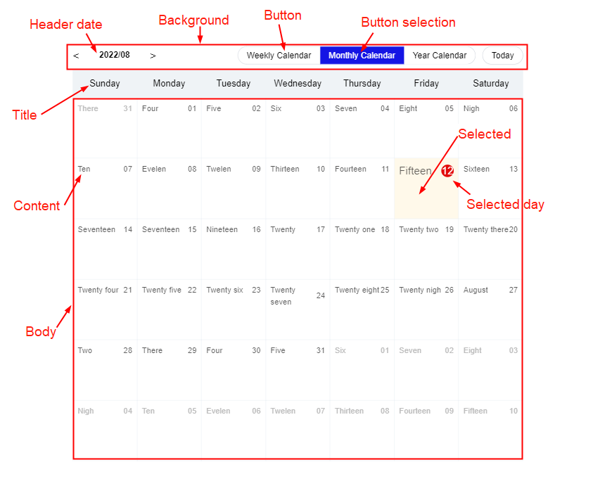
| Property | Refer to the following figure to set properties of the element. | |
| Interact | Refer to the designing process under each layout for interaction details. | |
Programmable Component
Design custom elements by writing scripts.
Graphic Library
The supOS platform provides multiple graphic elements to form different industrial process flowchart. With dynamic effects, you can directly view equipment status through flowcharts.
Shapes
Contains irregular shape, circle, rectangle, oval, rounded rectangle, regular polygon, custom shape, triangle, star and arc.
For irregular shapes, double-click the last point and then double-click the canvas to finish drawing.
| Parameter | Description | |
|---|---|---|
| Basic Settings | Position | Position of the element. |
| Size | Width and height of the element. | |
| Rotate | Rotation angle of the shape. You can also click icons to turn the shape upside down or flip it. | |
| Number of Sides | Number of sides of the shape. Only available for regular polygon. | |
| Graphics | Style of the shape. Only available for custom shape. | |
| Layer | Layer of the shape. You can select different layers under Layer at the lower-right corner to view corresponding shapes. | |
| Visible | Whether the shape is displayed. | |
| Filling | Enable it and select a color to fill the shape. | |
| Border | Enable it and set the border color, style and width of the shape. | |
| Mark | Enable it and set the content, background color, border style and font style of the mark that shows at the upper-right corner of the shape. | |
| Hot Area | Enable it and select a color. When hovering over the shape in operation center, its border is highlighted and fill color does not take effect. info Only available for irregular shapes. | |
| Right-click Menu | Customize a right-click menu for the shape. | |
| Interact | Refer to the designing process under each layout for interaction details. | |
You can set dynamic effects for shapes. For details, seeDynamic Effect.
Text
| Parameter | Description |
|---|---|
| Basic Settings/Filling/Mark/Right-click Menu/Interact | Similar to shapes. For details, see Shapes. |
| Character | Enter the text content and set its font styles, line height and whether to display text vertically. |
Connect
Connects two graphic elements together. You can click the Connect element and then click two elements you want to connect.
Configurations of property and dynamic effect are similar to shapes. For details, seeShapes and Dynamic Effect.
Image
For details, see Picture.
Pipeline
Select the pipeline element, and then click on the canvas, double-click the last point to finish drawing.
- Basic settings/border/mark//right-click menu: Refer to Shapesfor details.Thickness under Basic Settings defines the pipeline thickness.
- Filling: Enable it and set its color and specular color.
- Dynamic effect: Refer to Dynamic Effect Configuration for details.
Data Connection
Binds with numeric object property or expressions to display the real-time data of tags. When bound with an object property, you can right-click the element to view the trend chart of tag data in operation center.
Draw a data connection element on the canvas, and then set the properties in the pop-up window.
Data Source Configuration
- Select an object property or write an expression to be the data source.
- Set the data integer digits and decimal places.
- info
When the set Integer Digits are more than that of the selected data, the data will be compensated with 0. If less, the data will be displayed as it is. For example, the data is 352.69, Integer Digits is set to 5, the data is displayed as 00352.69. If Integer Digits is set to 2, the data is displayed as 352.69.
- Select the display name of the data in operation center.
- Select whether to display data value, unit and tag status in operation center.
General Property Configuration
Under Equipment Vibration Analysis, enter the link of third party spectrogram of equipment vibration analysis, and then you can view the corresponding spectrogram when checking the single point trend of the connected tag in operation center.
Line Segment
Draw line segments on the canvas. You can only draw a horizontal
line and turn it around through  .
.
- Basic settings/border/mark//right-click menu: Refer to Shapes for details.
- Dynamic effect: Refer to Dynamic Effect Configuration for details.